How to Use Color Grading in Lightroom Classic: A Comprehensive Guide
If you're a long-time user of Adobe Lightroom Classic, you may be familiar with the Split Toning feature. However, starting from Lightroom Classic version 10.0, Split Toning has been replaced by a brand new color grading tool called Color Grading.
This Color Grading feature resembles the color grading tools found in video editing software, but when you see those three color wheels, you might feel a bit confused about what they do.
In this tutorial, we'll demystify the magic of Color Grading in Lightroom and show you how to use it effectively. So, let's get started!

In this article, you will learn:
- What Is Color Grading in Lightroom Classic?
- How to Apply Color Grading Globally in Lightroom?
- How to Use Lightroom Color Grading Properly?
- Frequently Asked Questions About Color Grading in Lightroom
What Is Color Grading in Lightroom Classic?
The Color Grading feature in Lightroom Classic is a tool used to adjust the colors in different tonal areas of an image.
It allows you to make separate adjustments to the highlights, midtones, and shadows for hue, saturation, and luminance, thereby changing the overall color style and atmosphere of the photo.
Introduced in Lightroom Classic version 10.0, Color Grading replaces the previous Split Toning feature and adds the option to adjust midtones while providing a more precise color selection through the use of color wheels.
To use the Color Grading feature, simply locate the Color Grading panel in the Develop module. You can switch between adjustment modes above the panel.
In summary, Color Grading offers both global adjustments and split toning adjustments, making post-processing color adjustments more precise and providing greater control over the final result.
How to Apply Color Grading Globally in Lightroom?
In a way, Lightroom's Color Grading feature is like an enhanced version of Split Toning, simplifying the process of adjusting simple tonal ranges.
For example, in the photo below, since there are hardly any shadows, you can directly use the global adjustment in Color Grading to add a warm tone to the image.
Simply drag the color wheels to find the desired color and make fine adjustments using the hue and saturation values below.
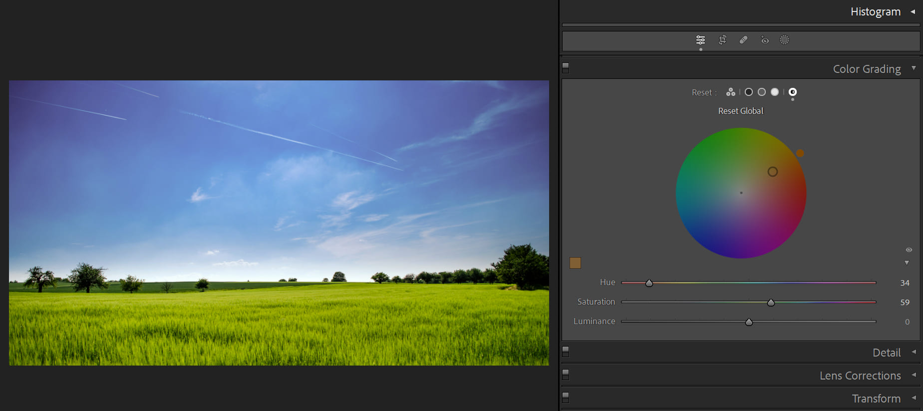
One of the biggest advantages of the color wheels in the Color Grading panel is that they overcome the confusion caused by the hue slider.
For example, the hue slider for red has a yellowish-red on the left side and a purplish-red on the right side. Understanding this solely through the slider can be difficult, but that's exactly what you see in the color wheel with the adjacent colors on either side of red.
Color Grading makes it much easier to understand and manipulate the hue setting. When adjusting, you can simply slide within the color wheel and instantly see the changes reflected in the image on the left, making it incredibly intuitive.
Color Grading offers three very useful tools, and we'll introduce them one by one:
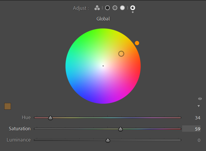
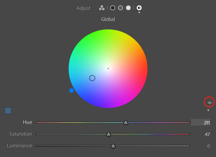
1. HSL Adjustment Sliders
Within the Shadows, Midtones, Highlights, and Global panels, you'll find a small triangle icon on the right side. Clicking on it opens the HSL parameter sliders.
You can make adjustments to the overall image within the Global panel without having to go back to the Basic settings for fine-tuning. This improves efficiency in color grading and reduces unnecessary repetitive actions.

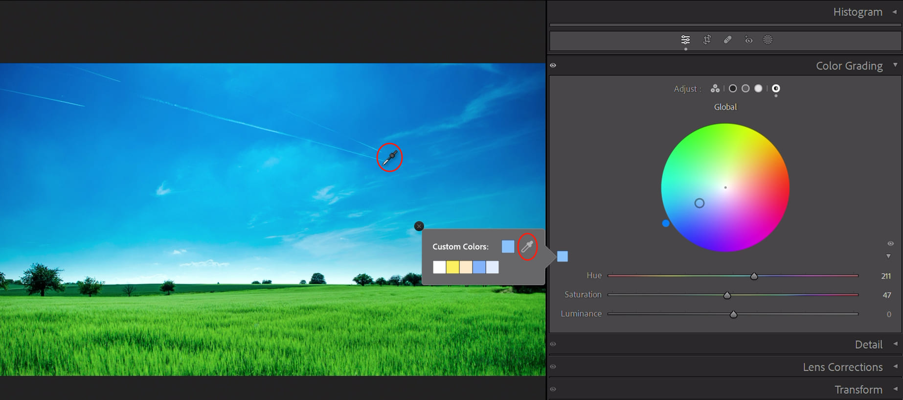
2. Custom Colors
On the left side of the Shadows, Midtones, Highlights, and Global panels, you'll find small squares that offer several Custom Colors. These are like default presets provided by Lightroom Classic and yield good results.
But the most useful feature is the eyedropper tool within Custom Colors.
While holding down the mouse button, move the eyedropper tool to any position in the photo to sample the existing colors and make adjustments to the photo's tones. (Lightroom will automatically adjust the hue and saturation of the photo based on the point you sampled.)
This makes the color grading results appear natural, without introducing mismatched colors that would make the photo look strange or artificial. The safest color scheme is to use the colors already present in the photo.
3. Viewing Adjustment Effects
On the right side of the Shadows, Midtones, Highlights, and Global panels, you'll find a small eye icon that can be used to disable the adjustment effects and compare the before and after colors.
(Clicking it temporarily disables the effects while holding it down keeps the effects disabled, and releasing the mouse button restores the adjustment effects.)
The best part is that this feature doesn't get recorded in history, making it quick and easy to view adjustment effects without cluttering your editing process.
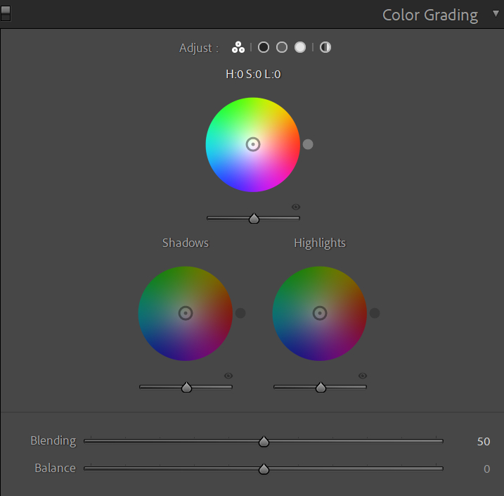
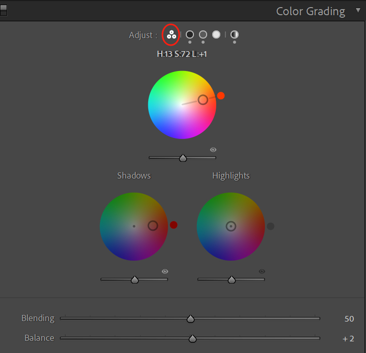
Color grading involves adjusting the highlights, shadows, and midtones of a photo separately. You can switch between different modes of color grading using the icons at the top of the Color Grading panel.
The 3-Way panel displays the color wheels for highlights, shadows, and midtones simultaneously. If you prefer to adjust the highlights, shadows, and midtones within a single panel, you can use the 3-Way panel to make the desired adjustments.
Here's a brief explanation of highlights, shadows, and midtones, and how you can individually adjust each tone based on their affected areas:
- Highlights refer to the brightest parts of the photo, usually white or near-white areas.
- Shadows refer to the darkest parts of the photo, usually black or near-black areas, such as those captured in low-light environments.
- Midtones are the transitional areas between highlights and shadows in the image. Adjusting midtones can help fine-tune the overall brightness and tones of the photo, making it look more natural and smooth.
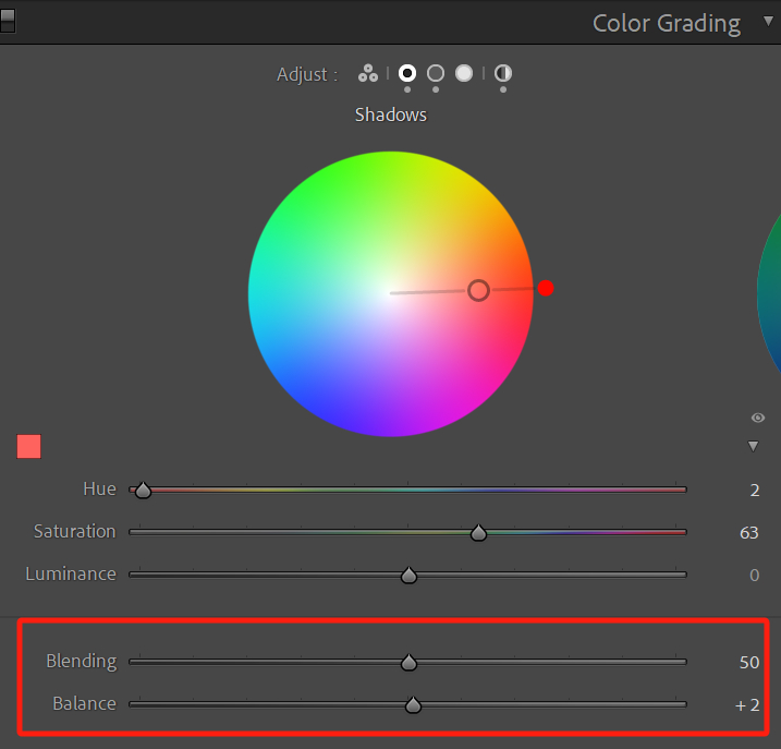
Under each panel, there are blending and balance parameter sliders that have the same effect regardless of their placement.
1. Blending Setting
The blending setting can be understood as the opacity or intensity of the effect. It allows you to fine-tune the results of your adjustments for the three tones.
For example, if you feel the colors are too intense and artificial, decreasing the blending parameter will make the overall effect more subtle. Conversely, increasing it will make the effect more pronounced.
2. Balance Setting
The balance setting refers to the range of influence between highlights and shadows. By adjusting the balance, you can alter the color proportions in the original photo.
For instance, if a photo has a lot of shadows and you want to extend the warm tones of the highlights to cover a larger area and introduce some warmth to the shadows, you can adjust the balance slider. It can also allow the shadow color to affect the midtones and highlight areas.
How to Use Lightroom Color Grading Properly?
When using Color Grading in Lightroom Classic, you can actually combine global adjustments and highlights/shadows/midtones adjustments for even better results.
When it comes to color grading, following a specific order can be quite helpful. Start by analyzing the tones in your photo. If the tones are relatively simple and the composition is straightforward, you can go ahead and use global adjustments directly.
For more complex tones, like city streets or sunsets with buildings, you can first adjust the highlights, shadows, and midtones separately in the 3-Way panel to get an approximation of the desired effect.
Then, switch to fine-tuning each tone individually. Finally, consider whether or not to use global adjustments to add an overall color to the photo.
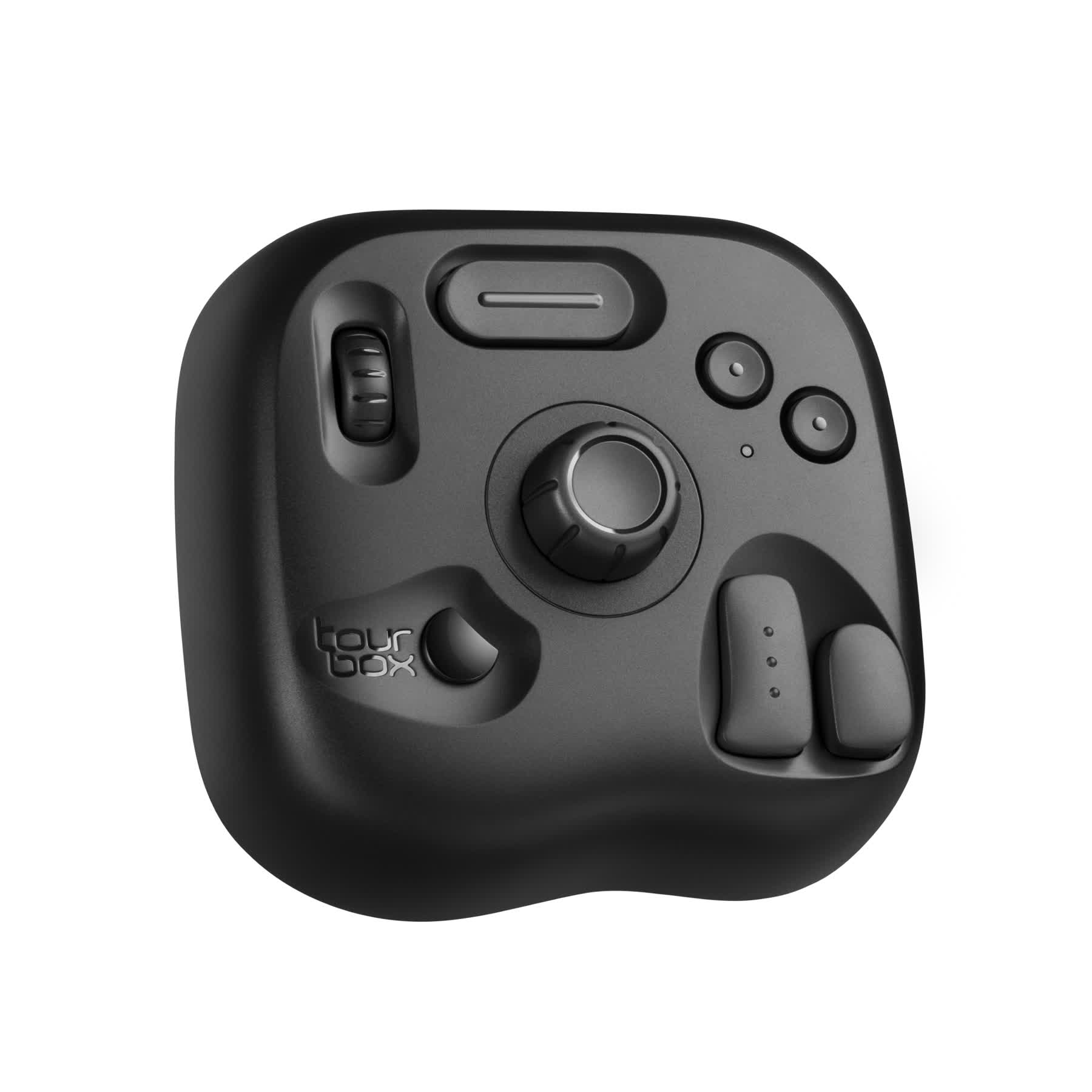
Color grading is subjective and there are no fixed parameters or styles that work for every photo. However, there is a creative tool that can make the color grading process more intuitive and efficient: TourBox.
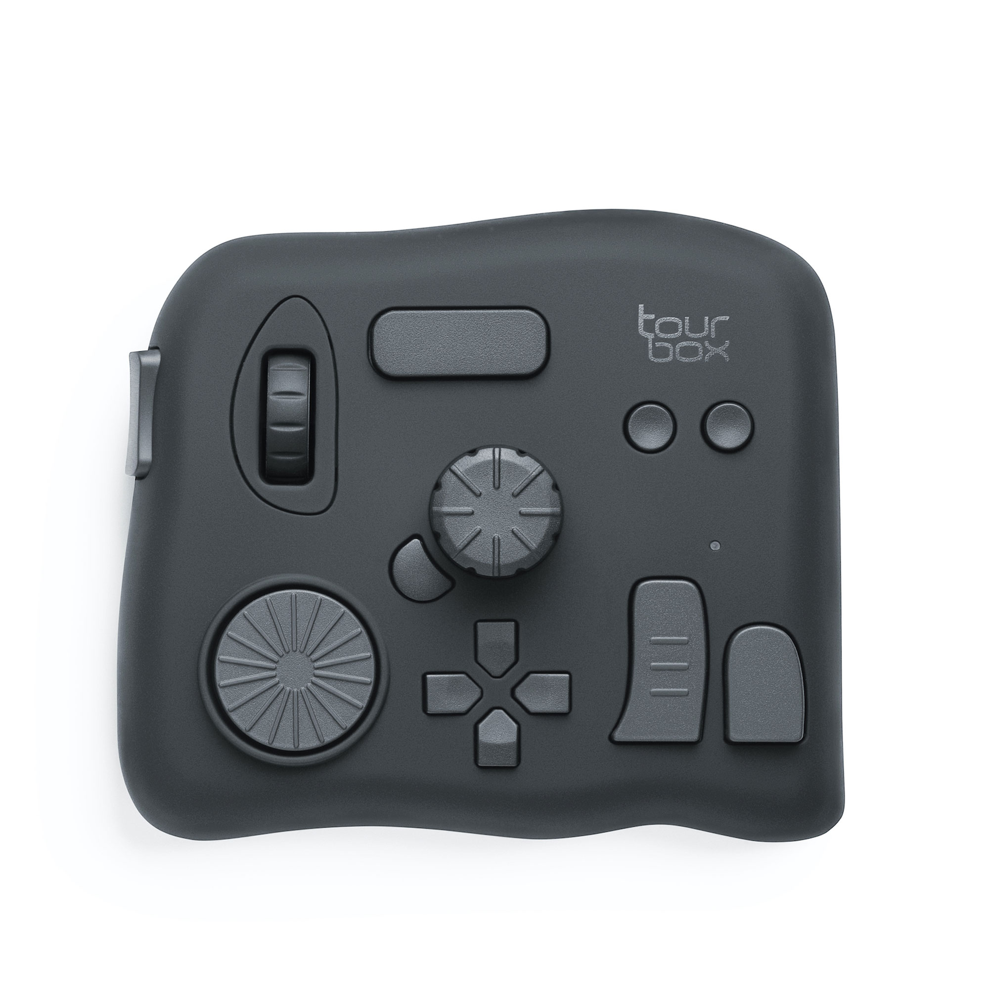
With TourBox, you can instantly access the desired adjustment panel and use its rotating controls to incrementally adjust the corresponding parameters. This process is highly intuitive and frees you from the inconvenience of using a keyboard and mouse, allowing for precise parameter control with just one hand.
In addition, TourBox provides TourMenu and macro functions that offer more versatility and creativity in your operations. For example, you can use TourBox's macro function to batch color-grade photos in Lightroom Classic with just one click.
TourBox seamlessly integrates with various software, not just photo editing software but also video editing software, digital art software, office software, and more. Its simplicity and efficiency can bring about a significant change in your creative journey.
Frequently Asked Questions About Color Grading in Lightroom
Question: What Is the Difference Between Color Grading and White Balance?
White balance is primarily used to correct the color temperature in an image, making white appear true. Color Grading, on the other hand, is more extensive. It allows for deeper color adjustments throughout the entire image, including highlights, shadows, and midtones.
Question: How to Use Color Grading in Lightroom Classic?
Open the Develop module, then locate the Color Grading option under the Color Mixer panel on the right side. You can achieve the desired effect by adjusting the color wheels for Highlights, Midtones, and Shadows.
Question: Does Color Grading Affect the Details in the Image?
Color Grading may impact the overall contrast and color distribution of the image, but it generally does not significantly affect the details. It is recommended to use it with caution to avoid excessive adjustments.
Product Recommendation:
If you haven't tried TourBox yet, you might want to consider our latest product, TourBox Lite. It's more affordable and easier to set up, allowing you to quickly get started with effortless one-handed editing!