Essential Color Knowledge Every Photographer Must Know
In photography, color is a key ingredient for passing on feelings, shaping your subject, and making your images pop. It's a skill every photographer needs to learn, since color guides both your shooting and your editing.
If you want to master color grading in post-production, start by learning the basics of color theory. Once you've got those down, you can handle any editing tool with confidence. In this article, let's dive into the essential color knowledge every photographer should have.

In this article, you will learn:
- What Is Color Space?
- What Is Bit Depth?
- What Are Color Modes?
- How Are Colors Mixed?
- Warm and Cool Tones in Photography
- Emotional and Psychological Associations with Colors
- What Is White Balance?
- Common Color Strategies for Photography
- Color Pitfalls to Avoid in Photography
- Conclusion
What Is Color Space?
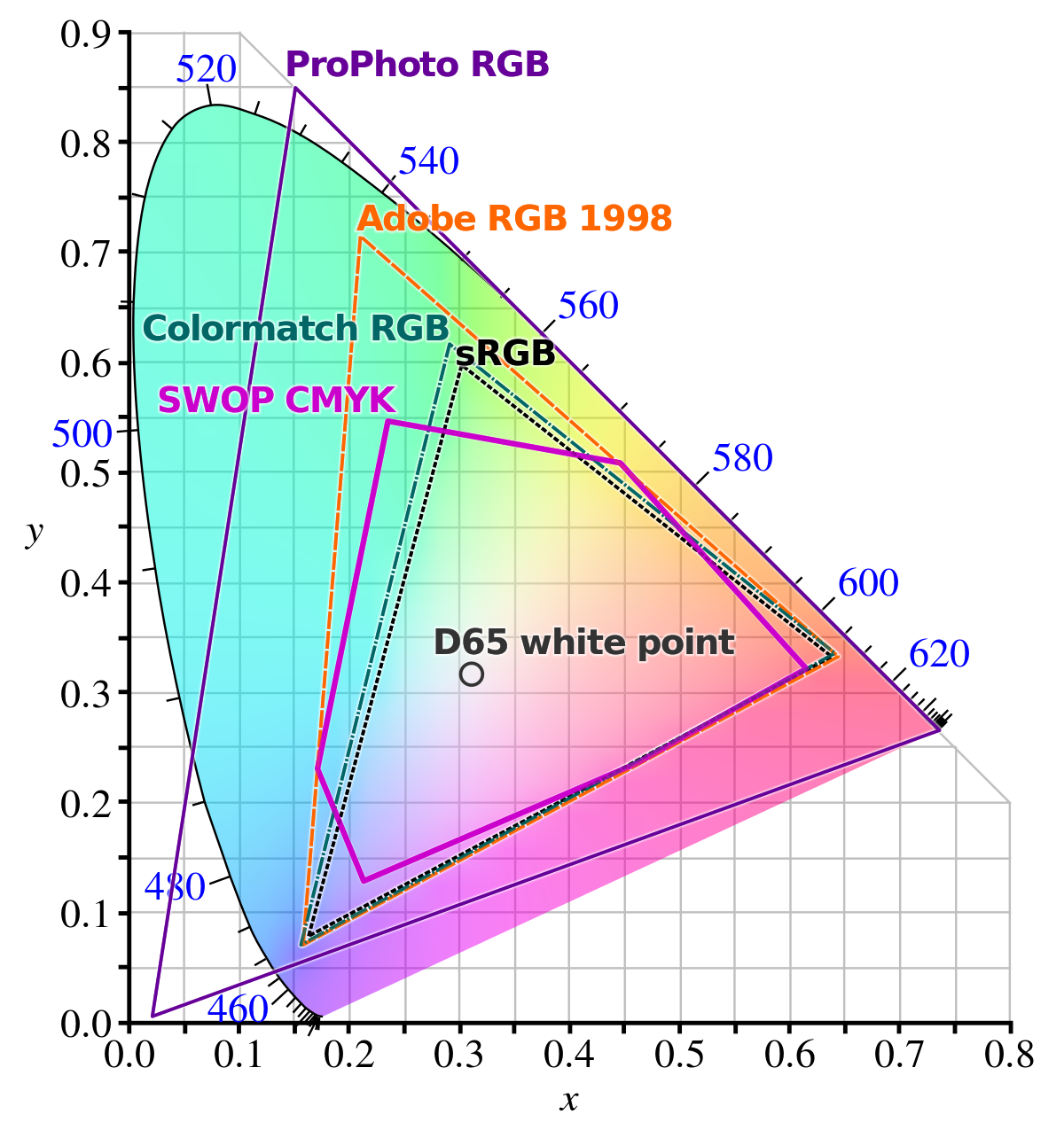
Color space refers to the range of colors a device can display. Colors outside this range cannot be shown.
For photographers, there are three key color space concepts to understand:
- sRGB: The most common, suitable for web display and most consumer printing. It has a relatively small color range.
- Adobe RGB: Offers a wider color range than sRGB, capturing richer greens and cyans. Ideal for professional photography and print publishing.
- ProPhoto RGB: A professional-level color space used for high-end photo editing and color management.
In digital cameras, there are two color spaces: Adobe RGB and sRGB. These are relevant only when shooting JPG images or previewing RAW images (since cameras cannot preview RAW files, highlights in RAW previews may be misjudged; the preview is actually a JPG).
The color space in the camera is unrelated to shooting in RAW format. When shooting RAW, the color space is not displayed.
Further Reading:
What Is Bit Depth?
Bit depth, also known as color depth, refers to the level of detail in the color information of an image. It is the number of binary digits used to describe the color of each pixel, which determines the transitions and variations between colors.
For digital photos, bit depth indicates how many bits are used to store the color of a single pixel, also known as bits per pixel (bpp). The higher the bit depth, the more colors can be represented, and the smoother the color transitions.
Bit depth is described in terms of "n-bit color." If the bit depth is n bits, then there are 2^n color choices, and n is the number of bits used to store each pixel.
Common bit depths are 8-bit/channel, 16-bit/channel (in software), and 12-14 bits/channel (in cameras):
- 8-bit/channel: JPG format only supports 8-bit color depth, allowing 256 levels of each color (0-255), with a total of 16.7 million possible colors (2^8 x 2^8 x 2^8 = 16.7 million).
- 16-bit/channel: Photoshop supports 16-bit color depth, offering 65,536 levels per color (0-65,535), allowing for 281 trillion possible colors (2^16 x 2^16 x 2^16 = 281 trillion).
- RAW formats in cameras: RAW files offer 12-bit and 14-bit color depth (some high-end medium format cameras support 16-bit RAW files). Most popular RAW formats support 12 or 14 bits, which are lossless. It's recommended to use 14-bit for higher color accuracy. A 14-bit image allows for 16,384 levels (0-16,383) per color, resulting in over 4 trillion color possibilities.
It's important to note that since Photoshop and Adobe Camera Raw cannot directly edit 12-bit and 14-bit files, when exporting RAW files from the camera, only 8-bit and 16-bit options are available in the software.
Comparing these numbers, 14-bit RAW files contain far more color information than JPG files. When converting a 14-bit RAW file to JPG, an average of 262,144 colors in the RAW file will be compressed into just one color in the JPG file.
From a post-processing perspective, 14-bit RAW files offer much more detail. With proper editing, you can significantly improve the image quality. In contrast, JPG files, with fewer details, have greater limitations in post-processing and cannot match the flexibility of RAW files.
Of course, if you don't consider post-processing, the visual difference between RAW and JPG might be almost imperceptible to the naked eye. However, professional photographers aiming for the best image quality often prefer shooting in 14-bit RAW format.
Summary: A wider color space records more colors, and a higher bit depth results in more refined color transitions. This is why shooting in RAW format is preferred.
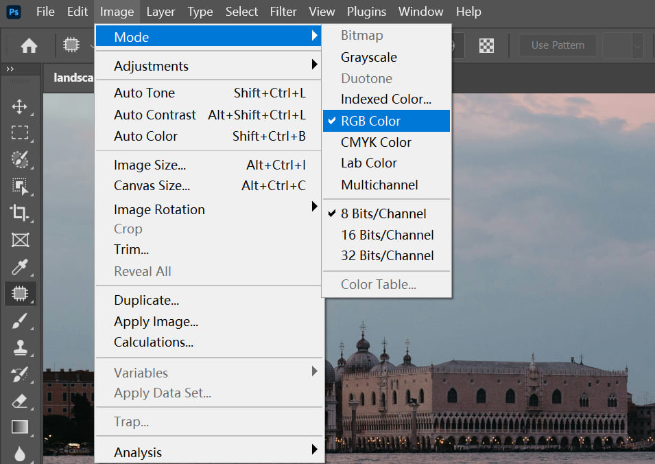
What Are Color Modes?
Color modes refer to algorithms used to create colors. In Photoshop, there are four color modes to choose from: RGB Color, CMYK Color, HSB Color, and Lab Color.
1. RGB Color
RGB stands for the three primary colors of light: Red (R), Green (G), and Blue (B). Each of these colors is represented by values ranging from 0 to 255, meaning each light color has 256 possible shades. RGB is the foundation of digital photography (camera sensors and display screens both use RGB).
Monitors use the RGB color mode, where each pixel has three light-emitting diodes (LEDs) for red, green, and blue. When the green LED lights up, the pixel shows green. If you also light up the red LED, the two colors mix together to create yellow.
However, the red LED's light doesn't affect the green LED's light. Instead, the color red is added to the existing green, which is why RGB uses additive color theory, where colors are created by mixing light.
![]()
When R, G, and B are combined, they can create 16,777,216 different colors (256 × 256 × 256). When R, G, and B are all set to 255, the result is white light.
Further Reading:
RGB is the default color mode in Photoshop and is widely used for editing high-quality color images.
Whether it's a scanned image or a created image, it's typically stored in RGB mode. In RGB, you can use all of Photoshop's commands and filters, and RGB images take up less space than CMYK images, saving storage space.
RGB represents the three primary colors of light, meaning it applies to objects that can emit colored light, like a computer monitor. It follows "additive color" theory, where more light makes the color brighter, resulting in a brighter final color.
sRGB, Adobe RGB, Apple RGB, and ProPhoto RGB are all different RGB color spaces. Each color space has a different range of colors, so the color output on the monitor may look different depending on the space used. This is why the same photo can look different when output from two different color spaces.
2. CMYK
The CMYK mode is used for printing, and it includes four standard colors: C (Cyan), M (Magenta), Y (Yellow), and K (Black).
In theory, the three CMY colors can create all colors, but due to printing limitations, pure black can't be achieved, so black (K) is added.
CMYK works similarly to RGB, but the way it creates color is different. RGB uses additive color mixing (colors are added together), while CMYK uses subtractive color mixing (colors are subtracted from the white background).
In CMYK, the combination of C, M, and Y can produce black, but because of impurities in the printing process, it can't create a true black or gray. Only when mixed with K (black ink) can it produce real black and gray.
CMYK is generally not used when editing images, because files in this mode take up more storage space, and many filters aren't available. CMYK is only used when preparing an image for printing, at which point the image is converted into the CMYK mode.
Further Reading:
3. Lab
Lab is a color mode based on human perception, not relying on light or pigments. It fills the gaps left by RGB and CMYK color spaces. Lab's color space is actually larger than what a computer screen or even human vision can see, but it's not commonly used in practice.
The Lab color mode is used within Photoshop for converting between different color modes. It represents color with one brightness component (L) and two color components (A and B).
- L ranges from 0 to 100 and represents lightness.
- The A component represents the spectrum from green to red.
- The B component represents the spectrum from blue to yellow.
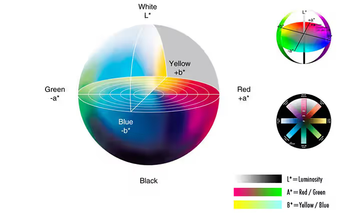
Both the A and B components range from -128 to 127.
Lab mode images consist of three channels, with each pixel having a 24-bit resolution. As a result, Lab is the color mode with the largest color range (also called color gamut), and it allows for accurate color exchange between different systems and platforms.
When converting an image from RGB to CMYK, Photoshop first converts it to Lab mode internally and then from Lab mode to CMYK.
4. HSB
HSB stands for Hue (H), Saturation (S), and Brightness (B). It's a color mode based on how people see color. Photoshop only uses HSB when you pick colors in the Color panel or the Color Picker.
Hue:
Hue is the color itself. You can see it on the color wheel from 0° to 360°. It sets the overall tone and temperature of a photo. Different hues bring different feelings (for example, red feels passionate, blue feels calm).
Saturation:
Saturation is the color's purity. A high saturation makes colors bright and vivid. Low saturation makes colors more gray. The range is 0% (gray) to 100% (pure color).
- High saturation gives a strong visual impact. It feels lively, bold, or dramatic (used in landscapes and ads).
- Low saturation feels soft, calm, subdued, or vintage (used in portraits and moody shots).
Adjusting saturation is key for setting mood and style.
Brightness:
Brightness is how light or dark a color is. The range is 0% (black) to 100% (white). Light direction affects brightness (things look darker in backlight).
Brightness ties closely to exposure. It affects overall light, contrast, and depth. High brightness feels light and fresh. Low brightness feels heavy, mysterious, or moody.
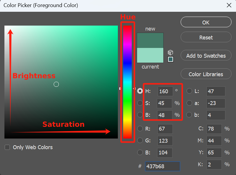
You'll usually see HSB controls in design programs' color adjustment tools. In Photoshop's Color Picker, the vertical color strip changes hue through red, orange, yellow, green, cyan, blue, purple, magenta, and back to red (0°–360°).
The square on the left adjusts saturation and brightness: move up for more brightness, down for less; move right for more saturation, left for less.
Further Reading:
How Are Colors Mixed?
Colors are endless, and we can't carry all of them with us. But as long as we have primary colors, we can mix millions of different shades. Take a look at a printer: it only has four ink cartridges, yet it can print images in many colors.
If you want to create yellow, how do you mix the three primary colors?
That's where the color wheel comes in. Whether you're using RGB or CMYK, the color wheel is universal.
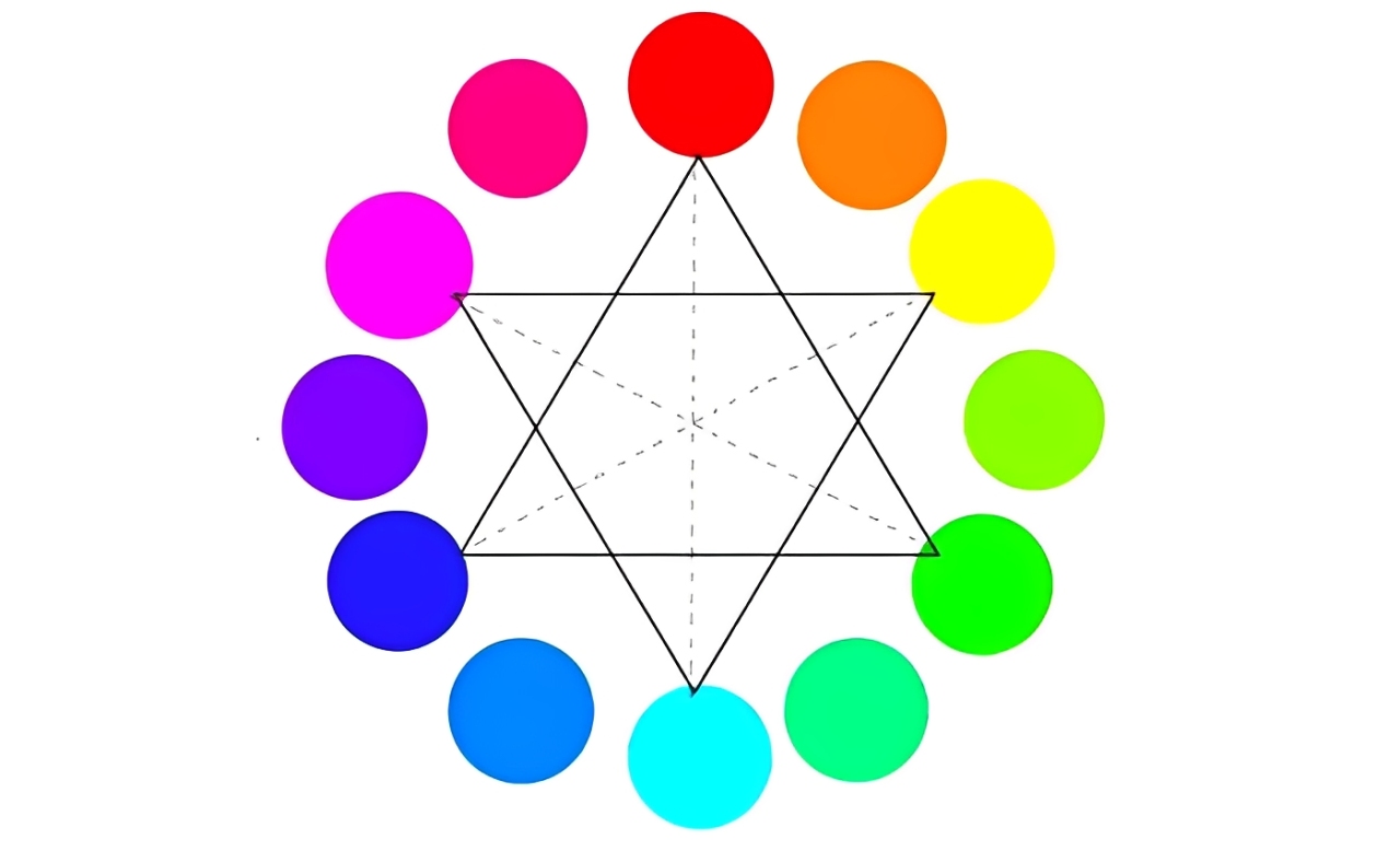
On the color wheel, colors are arranged clockwise every 60°: red, yellow, green, cyan, blue, and magenta.
- Analogous Colors: Colors that are within 60° of each other are called analogous colors, like red and yellow. Mixing these colors creates a harmonious and unified look.
- Complementary Colors: Colors that are between 120° and 180° apart are complementary colors, like red and green. Pairing complementary colors creates a strong visual contrast.
- Opposite Colors: Colors that are 180° apart are opposites, like red and cyan.
Before mixing colors, you can use the color picker to check the color's values (like RGB or CMY value). When mixing, keep these rules in mind:
- To add a color, you can also add its adjacent colors on either side by the same amount. For example, if you want to add 60° of yellow, you can also add red (60-60=0°) and green (60+60=120°).
- Adding the complementary color won't change the hue, but it will lower the saturation. For example, if you add cyan to red, the red will become less saturated, turning more grayish.
Further Reading:
Warm and Cool Tones in Photography
For photographers, the contrast between warm and cool tones can create a sense of space (warm colors seem closer, cool colors appear farther), set the mood, and guide emotions. A well-balanced photo usually mixes both warm and cool tones, even if one tone is the main focus.
Here's a simple breakdown of how warm and cool tones affect the viewer:
- Warm Tones: Red, orange, yellow, and their nearby colors. These colors give a sense of warmth, energy, excitement, and intimacy. They're often used to capture scenes like sunsets or food.
- Cool Tones: Blue, cyan, purple, and their nearby colors. These colors feel cold, calm, distant, and sometimes sad. They're commonly used for water scenes, shadows, winter, or technology.
Emotional and Psychological Associations with Colors
Colors can directly trigger emotional responses in viewers. For photographers, understanding basic color psychology can be very helpful, whether for composing the shot or for color grading in post-production:
- Red: Passion, love, energy, danger, anger, celebration.
- Orange: Energy, warmth, friendliness, creativity, autumn.
- Yellow: Happiness, sunshine, hope, warning, attention.
- Green: Nature, growth, peace, freshness, safety, calm.
- Blue: Calm, trust, professionalism, sadness, cold, technology.
- Purple: Mystery, royalty, luxury, romance, spirituality, creativity.
- White: Purity, cleanliness, simplicity, sacred, ethereal.
- Black: Power, elegance, mystery, death, fear, seriousness.
- Gray: Neutrality, balance, modernity, calm, sadness (depending on warmth or coolness).
As a photographer, you can consciously use color to communicate specific emotions or themes. It's also important to consider your audience's cultural background, as colors may have different meanings in different cultures.
For example, white symbolizes wedding dresses in Western cultures, while in some Eastern cultures, it may be associated with mourning.
Further Reading:
What Is White Balance?
Simply put, white balance is used to correct color shifts caused by different light sources (like daylight, shadows, incandescent, or fluorescent lights) so that white objects still look white under various lighting conditions.
White balance is crucial in photography! Incorrect white balance can cause serious color shifts in your photos (like making them look too blue or too yellow). While you can adjust it later in post-processing, setting it correctly in-camera saves a lot of time and helps preserve better image quality.
The key is understanding color temperature (measured in Kelvin, or K). A low value (like 2700K) is warm (yellow/orange), while a high value (like 6500K) is cool (blue).
You can also use white balance intentionally to create warm or cool atmospheres. For example, setting the white balance for overcast weather in daylight will make the image look warmer.
Further Reading:
Common Color Strategies for Photography
1. Portrait Photography
- Skin Tone Handling: Avoid over-saturation. Use yellow/orange tones, with a neutral background (like light gray or beige).
- Clothing and Background: Choose complementary colors for clothing (like blue background with orange clothes) or use analogous colors for a harmonious look (like pink clothing with a light purple background).
2. Landscape Photography
- Sunrise / Sunset: Use warm tones (red, orange) and cool tones (blue, purple) to create a gradient, with clouds to add depth.
- Forest / Lake: Emphasize the contrast between green and blue, or reduce saturation with morning fog to create a soft, dreamy feel.
3. Documentary and Street Photography
Capture color clashes in the environment (like colorful graffiti on old buildings), or switch to black and white to minimize color and focus on composition.
4. Product Photography
Use a solid color background (like pure white or black) to highlight the product's color. Light it evenly with reflectors or softboxes to avoid color shifts.
Color Pitfalls to Avoid in Photography
- Avoid Color Overload: Keep the main colors in your image to no more than three to avoid a cluttered look.
- Color Accuracy: When shooting products or portraits, prioritize true-to-life colors (for example, avoid overly warm tones in food photography).
- Moderation in Post-Processing: Raising saturation too much can cause color breaks (especially in skies and skin tones). It's best to make subtle adjustments and check the histogram.
- Output Color Space: Use sRGB for screen displays, and CMYK or Adobe RGB for printing (make sure to convert beforehand).
Conclusion
In this article, we've shared some essential color knowledge every photographer should know. Of course, these are just the basics—there's much more advanced color theory you can explore on your own.
When you're adjusting colors in post, there are moments when you need faster, more precise control over your settings.
That's exactly why TourBox was created. It's a creative controller that lets you map your favorite tools or shortcuts — like hue, saturation, and brightness — to a special TourMenu. In Lightroom, Camera Raw, or any other editing software, you just twist a knob or press a dial to get the exact color effect you want in an instant.

TourBox not only speeds up your workflow but also keeps your creative flow smooth and natural. No more breaking your concentration with endless mouse clicks. Whether you're deep into retouching after a shoot or quickly previewing color styles on set, TourBox is your perfect sidekick.

If you'd like to see how TourBox can boost your photo-editing efficiency, check out our Photo Editing page for more details.