Color Theory for Photo Grading: A Practical Guide
Photography isn't just about capturing light and shadow. It's an art that tells stories with color. Mastering color theory can lift your photos from merely documenting a scene to truly expressing something — turning pictures that are "nice" into ones that move people.
So don't let great photos get lost in dull tones. Join us today to unlock a game-changing secret: how to understand and use color theory in color grading.

In this article, you will learn:
- Color Isn't Mysticism: It's a Science You Can Follow
- Use Color to Convey Emotion Precisely
- How to Put Color Theory into Your Photo Grading?
- Common Mistakes to Avoid
- Conclusion
Color Isn't Mysticism: It's a Science You Can Follow
Many people think about color only as a "feeling.” They believe color grading is all intuition. But great painters and photographers know there's a clear logic behind color: color theory.
It's not a set of rules that limit you. It's a tool that helps you express visual ideas more clearly and accurately.
1. Know Your Tools: the Color Wheel and Basic Relationships
What's the color wheel? Think of it as the foundation for how colors relate to each other.
Imagine a disk with colors arranged in spectral order — red, orange, yellow, green, blue, indigo, violet — forming a circle. It's the go-to tool for analyzing color pairings.
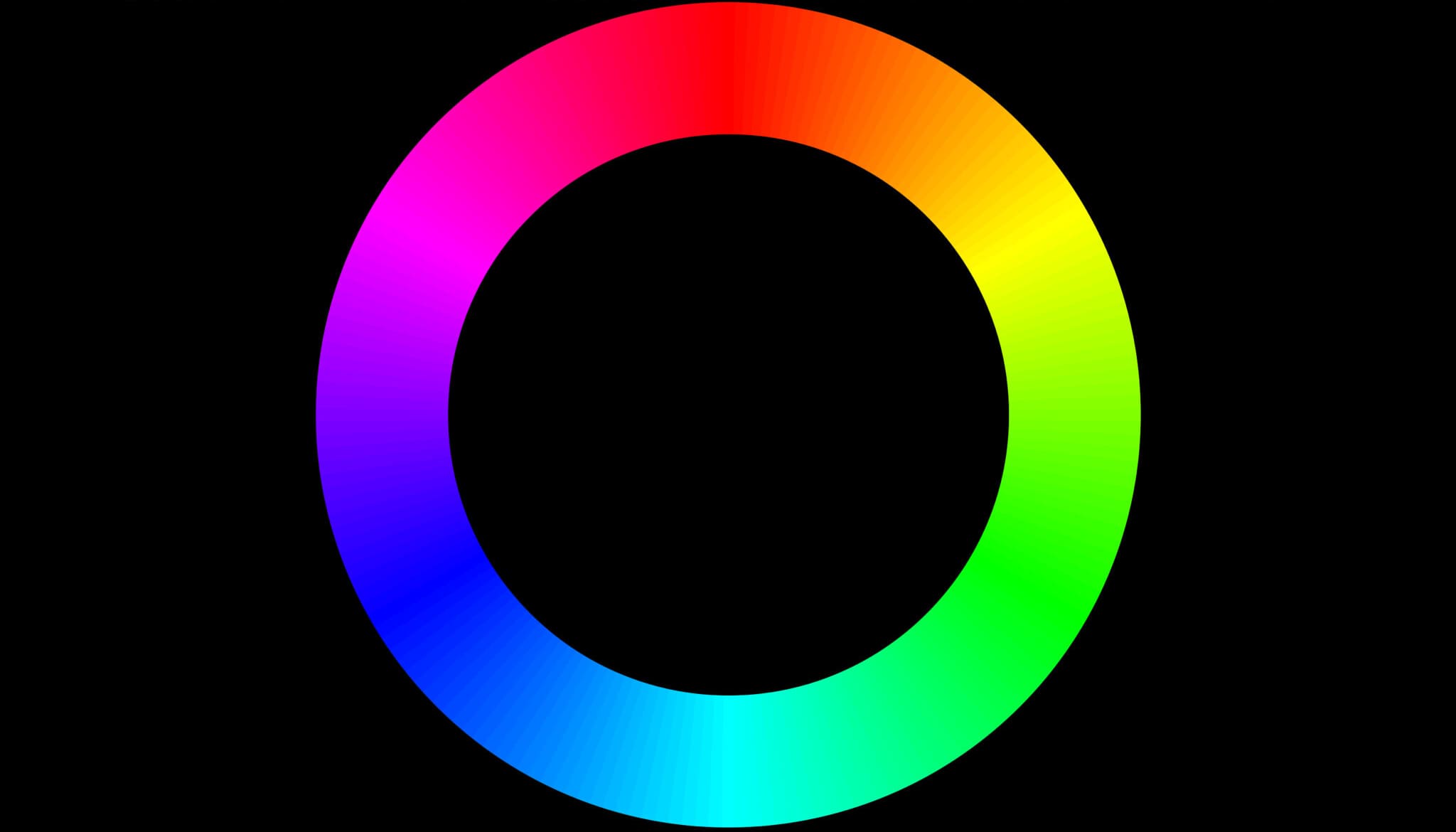
Complementary Colors:
These are pairs that sit opposite each other on the wheel (for example: red & cyan, blue & yellow, green & magenta). They create the strongest contrast. Put them together and you get big visual tension and energy that grabs attention instantly.
Examples: an orange sunset lighting a deep-blue sea; a model in a red dress standing in a green forest.
Analogous Colors:
These are neighbors on the wheel (for example: blue, blue-green, green, or yellow, yellow-orange, orange). They feel harmonious and unified. They're calming and cozy, and work well for peaceful or warm moods.
Examples: different shades of green in a quiet forest; a golden field with an orange-red sunset in autumn.
Triadic Colors:
These are three colors evenly spaced around the wheel (classic example: red, yellow, blue). They offer a strong contrast while staying balanced. They feel lively and playful when used well.
Examples: playground scenes or festival photos that need to feel joyful and energetic.
Split-Complementary Colors:
This is one color plus the two colors beside its complementary color (for example: blue + yellow-orange + red-orange). It's softer and easier to balance than a straight complementary pair, while keeping visual interest.
Example: a mostly-blue image with orange-yellow lights or props as accents.
Further Reading:
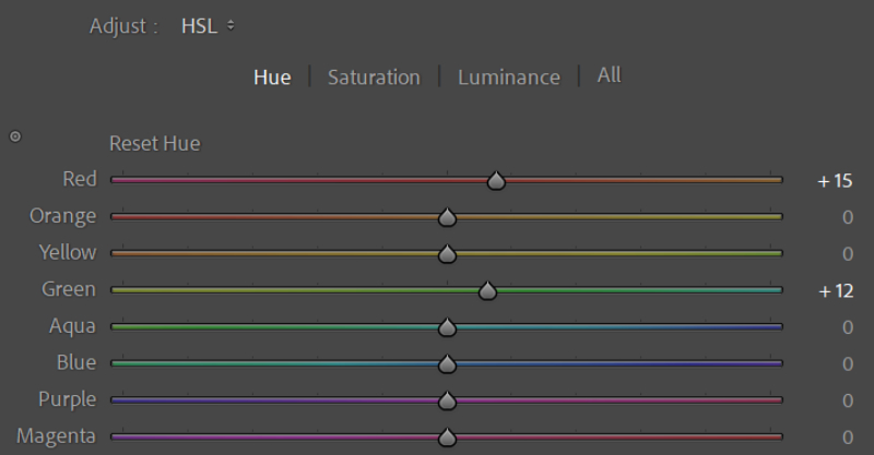
2. Use HSL: the Photographer's Color Toolbox
Most photo editors (Lightroom, Camera Raw, Capture One) put an HSL panel front and center. This model lets you precisely shape each color. Master HSL and you'll have the core skill for color grading.
- Hue: the color's name. Is it red, blue, or green? Changing hue changes the color itself.
- Saturation: how pure or vivid a color is. Higher saturation = brighter and more eye-catching. Lower saturation = closer to gray, calmer, or more subtle.
- Luminance: how light or dark the color is. Higher = closer to white and feels airy. Lower = closer to black and feels heavier.
Further Reading:
How to Use HSL in Lightroom Classic: A Guide to Color Adjustment
Many photographers choose Adobe Lightroom Classic for color grading. But editing inside LrC's native interface can feel cramped. It's easy to miss small details, and that can keep you from getting the best results.
That's why we recommend TourBox — a creative controller many photographers love.

TourBox is more than a shortcut device. Its built-in HSL Plugin Panel and the new Dynamic Panel let you leave LrC's native panels behind and grade photos full screen. With the sidebar out of the way, you can focus on the image itself.

TourBox simplifies every step of photo editing. It's highly customizable and ergonomically designed, so editing feels faster and more comfortable than before. If you're interested, visit our Photo Editing page to learn more.
Use Color to Convey Emotion Precisely
Color has strong psychological power. It can guide how viewers feel without saying a word. It's one of the best tools for setting mood and telling a story.
1. Warm Colors (Red, Orange, Yellow)
Think of them like fire. They show passion, energy, excitement, warmth, and friendliness. But depending on saturation and brightness, they can also suggest danger, urgency, or aggression.
Examples: a steaming cup of coffee in brown-yellow tones feels cozy; a bonfire night in reds and oranges feels lively and joyful; golden autumn leaves suggest harvest and contentment.
2. Cool Colors (Blue, Green, Purple)
They're like a calm lake or the night sky. Cool tones bring calm, coolness, stability, professionalism, or distance. They can also hint at sadness, mystery, or a futuristic vibe.
Examples: a misty morning lake in blue-green; a tech product's serious, cool look in deep blue; a rainy alley's melancholy in blue-gray.
3. Neutrals (Black, White, Gray, Brown)
Neutrals set the base and help everything else work together.
- Black and white: They create the strongest contrast. Black often feels powerful and timeless. White feels clean and pure. Both are common in minimalist, documentary, and high-contrast styles.
- Gray: Gray brings balance, refinement, and a modern feel. Different shades of gray build rich layers and subtle depth.
- Brown: Brown feels natural, earthy, and reliable. It also gives a vintage or nostalgic vibe and is common in earth-toned and retro looks.
Learn these basic color moods, and you can grade photos with purpose. You'll be able to make images feel the way you want.
Further Reading:
How to Put Color Theory into Your Photo Grading?
Theory is the foundation. Practice makes it real. Want to use color theory in Lightroom, Capture One, or Camera Raw? Try these steps:
1. Be Clear About Your Goal
Ask yourself: What story should this photo tell? A calm morning, a lively party, a nostalgic street, or a cold industrial scene? Where do you want the viewer's eye to go first (the subject)? What emotion should they feel — warm, cool, sad, or excited?
Your answers set the direction. The mood you want will tell you which color relationships to use (use complementary colors to create a focal point, or analogous colors for harmony) and whether the image should lean warm (cozy, nostalgic) or cool (lonely, futuristic).
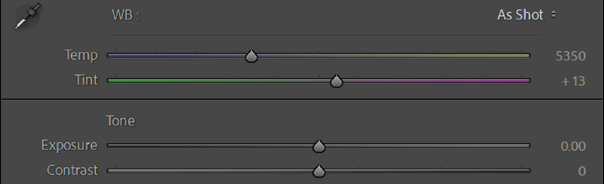
2. Set the Base: White Balance and Exposure
White Balance / Color Temperature: This is where grading starts. It sets the overall tone.
Adjust white balance so neutral whites look neutral and colors feel true. But you can also shift it on purpose to create a mood. Want a colder, lonelier rainy scene? Move the tone toward blue. Want a warmer, more nostalgic sunset? Shift toward yellow or orange. This basic choice has a big effect on the final emotion.
Exposure and Contrast: getting light and dark right is the base for good color.
- Exposure: Overexposing loses highlight color detail (blown-out whites). Underexposing makes shadows muddy (crushed blacks). Aim so you can see important details in both highlights and shadows.
- Contrast: The right contrast makes colors pop and adds depth. Too much contrast will lose midtone detail and make colors feel harsh or blocky.
Further Reading:
Basic Panel in Lightroom Classic: How to Rescue Your "Trash" Shots?
3. HSL: Your Tool for Fine, Surgical Control
This is where most of the real work happens. HSL lets you target specific color ranges in a photo (red, orange, yellow, green, etc.) and adjust them precisely.
(1) Make the Subject Pop
Use HSL to boost the subject's saturation and brightness. At the same time, lower the saturation or brightness of background colors so they recede.
Example: Make a bright red flower stand out by increasing the red saturation and brightness, and slightly desaturate or darken the greens around it.
(2) Create Harmony and Unity
Nudge scattered similar colors toward a single hue (tweak their hue). For example, pull different greens (yellow-green, emerald, deep green) closer to one balanced green.
Use analogous tones (like blue → blue-green → green), and then adjust their saturation and brightness to build subtle layers and a calm, cohesive mood.
(3) Add Drama and Contrast
Intentionally add warm light into a cool scene, or vice versa. Use complementary or split-complementary relationships to create a focal point and tension.
Example: In a blue-toned night shot, raise the saturation and brightness of orange-yellow for a streetlamp to make it the visual center. Or add a touch of cyan in the shadows of a warm portrait (via split toning or curves) for contrast.
(4) Strengthen the Emotion
Colors change how people feel. Use HSL to push the mood toward warm (cozy, nostalgic) or cool (lonely, distant). You can also tweak single key colors.
Example: Make blues in a sad scene deeper by lowering blue brightness and nudging hue toward indigo. For a happy scene, make yellows lighter and brighter by increasing yellow brightness.

Common Mistakes to Avoid
Learn the skills and the theory — but don't fall into these traps. Avoiding them will make your photos look more professional.
1. Oversaturation
Pushing saturation too far makes colors look fake. You can get color banding, blown-out patches, and lost texture. The result feels cheap and harsh.
Golden rule: less is more. Use vivid color to emphasize or convey mood — not to shock. Always check that the detail isn't being lost.
2. Unnatural Skin Tones
Natural, healthy skin tones are essential in portrait work. Start by fixing skin with the HSL panel: lower the saturation for the skin tone and increase its lightness slightly to make skin look clearer and softer.
Be careful: don't wildly change the skin's hue unless you're going for a specific artistic look. Avoid big global tweaks (like cranking overall saturation or color temperature) that can make skin look strange.
3. Color Chaos
If the background or environment is too loud or clashing with the subject, the image feels chaotic. Too many competing colors with no clear hierarchy will pull attention away from the main subject.
Fix it by setting a clear color hierarchy so the subject is the visual focus. Use HSL to unify or desaturate background colors. Lean on color theory (analogous or monochromatic schemes) to create harmony. Use local adjustments to darken or mute distracting elements.
4. Uncalibrated Monitor
Color grading on an uncalibrated screen is risky. What looks right on your display may look very different on someone else's.
Do this: calibrate your monitor. A hardware calibrator is ideal. Even software calibration helps. Make sure what you see is as close as possible to what others will see.
5. Blindly Applying Presets or LUTs
Presets and LUTs are great for quick starts or inspiration. But every photo is unique — different light, scene, and base colors. One preset won't work perfectly on every image.
Use presets as a starting point. Learn what the preset changes (which sliders, which color relationships). Then tweak exposure, white balance, and HSL to fit the specific photo.
Conclusion
Color theory isn't a set of rules that limits your creativity. It's a powerful visual dictionary and a toolkit you can use to express ideas. Learn it, master it, and use it in your color edits, and you'll be able to:
- Accurately convey emotion — make photos that truly move people and create a connection.
- Guide the viewer's eye — help people see the things you want them to see, easily.
- Build a unique style — create a personal visual signature.
- Lift the professional quality — move away from a casual "snapshot" look and give your images a more refined feel.
Color grading stops being guesswork and becomes a purposeful creation. Pull out a photo from your library that feels a little "meh." Try one of the color relationships or techniques from this guide.
For example, find complementary colors and boost the contrast, or unify analogous colors for harmony, or try the classic "warm highlights / cool shadows." See how a simple color change can make the whole image come alive.