Easy RGB to CMYK: Simple Tips for Natural-Looking Prints
For designers — whether it's brand work, logo design, or e-commerce graphics — if you want to turn your digital files into printed pieces, you'll often need to convert RGB to CMYK.
But you might run into a few hiccups along the way. So, how do you switch from RGB to CMYK, and what should you watch out for? Let's dive in.

In this article, you will learn:
- What Are RGB and CMYK?
- Why Colors Change When Converting RGB to CMYK?
- How to Convert RGB to CMYK in Photoshop?
- Tips for a More Natural RGB to CMYK Conversion
- Conclusion
What Are RGB and CMYK?
Put simply: use RGB for anything you'll view on a screen, and convert to CMYK when you're ready to print.
Here's the difference:
- RGB mixes Red, Green, and Blue light. Each channel runs from 0 to 255. This mode is made for monitors, phones, and TVs.
- CMYK mixes Cyan, Magenta, Yellow, and Black inks. Printers use these inks to lay down color on paper.
Further Reading:
Why Colors Change When Converting RGB to CMYK?
RGB uses light to mix colors. The more light you add, the brighter the color gets. When red, green, and blue are all at their highest, you see pure white. RGB can show about 16.7 million colors.
CMYK uses ink on paper to mix colors. The more ink you add, the darker the color gets. Even if cyan, magenta, and yellow are all at 100%, you still need black ink (the "K" in CMYK) to get true black. CMYK can reproduce only about 1 million colors.
Because RGB covers a much wider range of bright, vivid shades, some colors you see on screen can't be printed the same way. Bright electric blues or neon greens on your monitor will look duller when printed with standard four-color inks.
Since CMYK holds fewer colors, it has to squash or cut off some of the brightest RGB tones. That makes printed colors look less saturated and a bit off.
Also, screens glow from behind (self-lit), so colors look more vibrant. Printed ink just reflects light, so it always looks a bit darker and duller. Even if you convert an image's values from RGB to CMYK, the print will usually look darker than the screen preview.
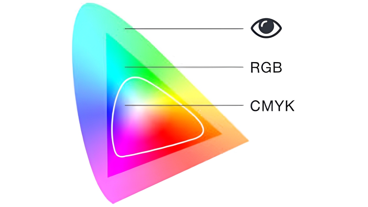
The image below shows how the human eye, RGB, and CMYK compare when displaying colors.
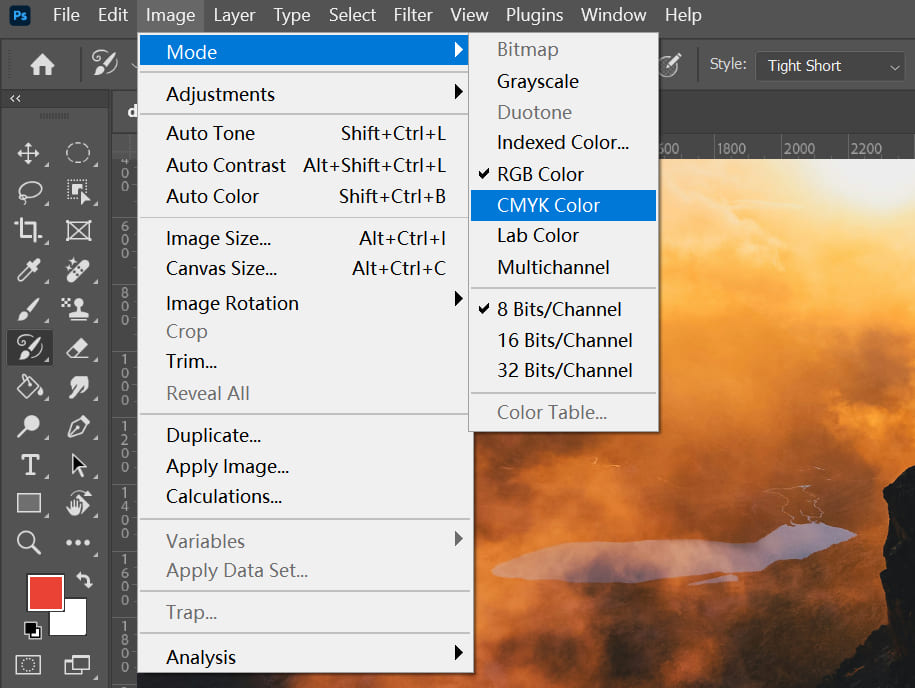
How to Convert RGB to CMYK in Photoshop?
Converting RGB to CMYK is something we do often, but it's really a compromise. RGB is a light-based color model and can show more colors. CMYK is for print and can't match all those shades.
Because CMYK has a smaller color range, some bright or subtle colors just can't be printed the same way. Prints look darker and less vivid. Tiny highlights and glows may even vanish.
Most of the time, there's no perfect fix — unless you can redraw those lost details by hand. Very few people can do that well.
We often start by converting the RGB image to CMYK right in Photoshop.
Then we open the original RGB file and use it as a visual guide. At that point, we tweak the CMYK version — boosting brightness, adjusting a curve, whatever it takes — to make it look as close as possible to the RGB.
You might wonder if there are exact settings to follow. There aren't any. You go by feel — your eye is the best judge.
That's why a high-quality monitor really matters. A display with precise color accuracy and a wide gamut, like Apple's, makes the work much easier.
Of course, this advice applies to photos. If you're laying out a design for print, start in CMYK mode from the very beginning. Don't plan to fix it later with a color conversion.
Tips for a More Natural RGB to CMYK Conversion
If your project is meant for print, we always recommend setting your color mode to CMYK from the start.
But if your design is already finished in RGB and you suddenly need to print it, don't worry — these post-production tips can help make the RGB to CMYK conversion look a lot more natural.
1. Reduce CMYK Channel Values
For key colors like brand colors or skin tones, it's better to adjust them by hand instead of relying on the software's automatic conversion.
When CMY values stack up too high, you'll lose detail in the darker areas. You can fix this by lowering the Black (K) channel and slightly increasing the CMY values to balance it out.
Also, avoid overly saturated colors. For rich black, it's recommended to use: CMYK (50,50,50,100) or CMYK (30,30, 30, 100).
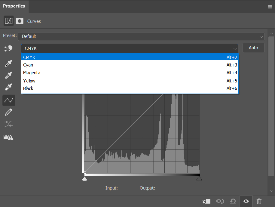
2. Fine-Tune in Photoshop
- Levels: Use Levels (Ctrl + L) to brighten the image. You can adjust input and output levels to tweak highlights and shadows.
- Curves: Use Curves (Ctrl + M) to fine-tune brightness and reduce unwanted grays. In CMYK mode, pulling the curve down makes it lighter (opposite of RGB). You can also flatten the curve in areas with high ink coverage to reduce ink density.
These are just two of the color tools you may use in Photoshop. But like we said before, once you convert RGB to CMYK, fine-tuning your colors still comes down to your own eye.
That's why we want to recommend a favorite designer tool for post-production: the TourBox.

With a quick setup, you can launch the Color Picker in one click and grab colors faster. When you move the color sliders, TourBox's Knob give you a direct, precise feel.
It's like using a game controller to play. TourBox makes any creative software feel more intuitive, cuts out extra steps, and really speeds up your workflow.

3. Simplify Colors
If your main color is blue (mostly C and M), focus on keeping the C/M ratio consistent and reducing Y and K as much as you can.
Example:
- Before: (80, 60, 20, 10)
- After: (80, 60, 0, 0)
When you have multiple colors, pick one as the dominant color and simplify the others. The fewer color mixes you have, the purer and cleaner your printed colors will look.
4. Use Pantone Spot Colors
If post-production adjustments still aren't getting you the color you want, or you need precise, consistent color, consider switching to Pantone Spot Colors.
A Spot Color is a premixed ink made to print a specific, solid color. Each spot color has its own formula and code, typically from the Pantone Matching System (PMS). This ensures your colors look exactly the same no matter which printer or material you use.
So why not just use spot colors for everything? The main reason is cost.
Each spot color requires an extra plate or ink slot in a digital printer, which drives up the printing cost. Adding a single spot color can increase your expenses by 50% to 100% over regular CMYK printing, depending on how many you use and your print run size.
That's why designers need to plan carefully, balancing color accuracy with budget limits.
Conclusion
Hope these tips help you get better colors when you switch from RGB to CMYK! Of course, if you know from the start that your project is for print, the best move is always to set the color mode to CMYK right away.